![AI [re]Generation](https://substackcdn.com/image/fetch/$s_!L6aZ!,w_120,h_120,c_fill,f_webp,q_auto:good,fl_progressive:steep/https%3A%2F%2Fsubstack-post-media.s3.amazonaws.com%2Fpublic%2Fimages%2Fd316565c-2791-4f13-a334-efcf2499510d_768x768.png)
Image Generation Just Became Useful for Business Work
Four tests that changed my mind on image generation for real work.


AI image generation has been in the “experimental tools” category for me until this week. The outputs have rarely been of high enough quality to use in our deliverables: text rendered illegibly in most attempts, layouts were imprecisely composed, and small details that mattered (logos, labels, names on slides) were unreliable.
That changed this week with the release of ChatGPT Images 2.0. I spent a couple of evenings testing it on real tasks, and I can confidently say that many of the outputs would now stand up to use in actual business work.
What changed in ChatGPT Images 2.0
One of the headline announcements is that the model can now reliably render readable text inside images, including in non-Latin scripts (Japanese, Korean, Chinese, Hindi), which has notoriously been difficult for image generation models.
Two other features make this release special:
Multi-image consistency lets the model keep the same subject (a face, an object, a visual style) across up to 8 images in a single prompt.
Thinking mode, available with a paid ChatGPT plan, makes the model reason about layout and content before generating, and can search the web for up-to-date facts.
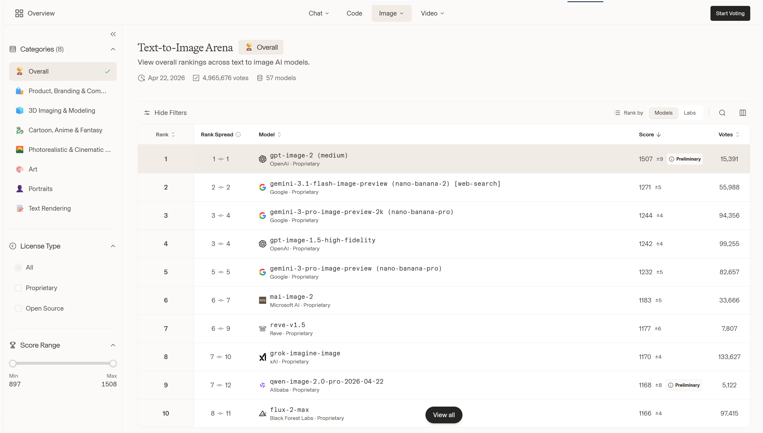
For context: ChatGPT Images 2.0 leads Google’s Nano Banana Pro by over 200 Elo points on the LMArena image leaderboard, the largest gap recorded between any two image models there.
Test 1: Turning a Substack article into an illustration
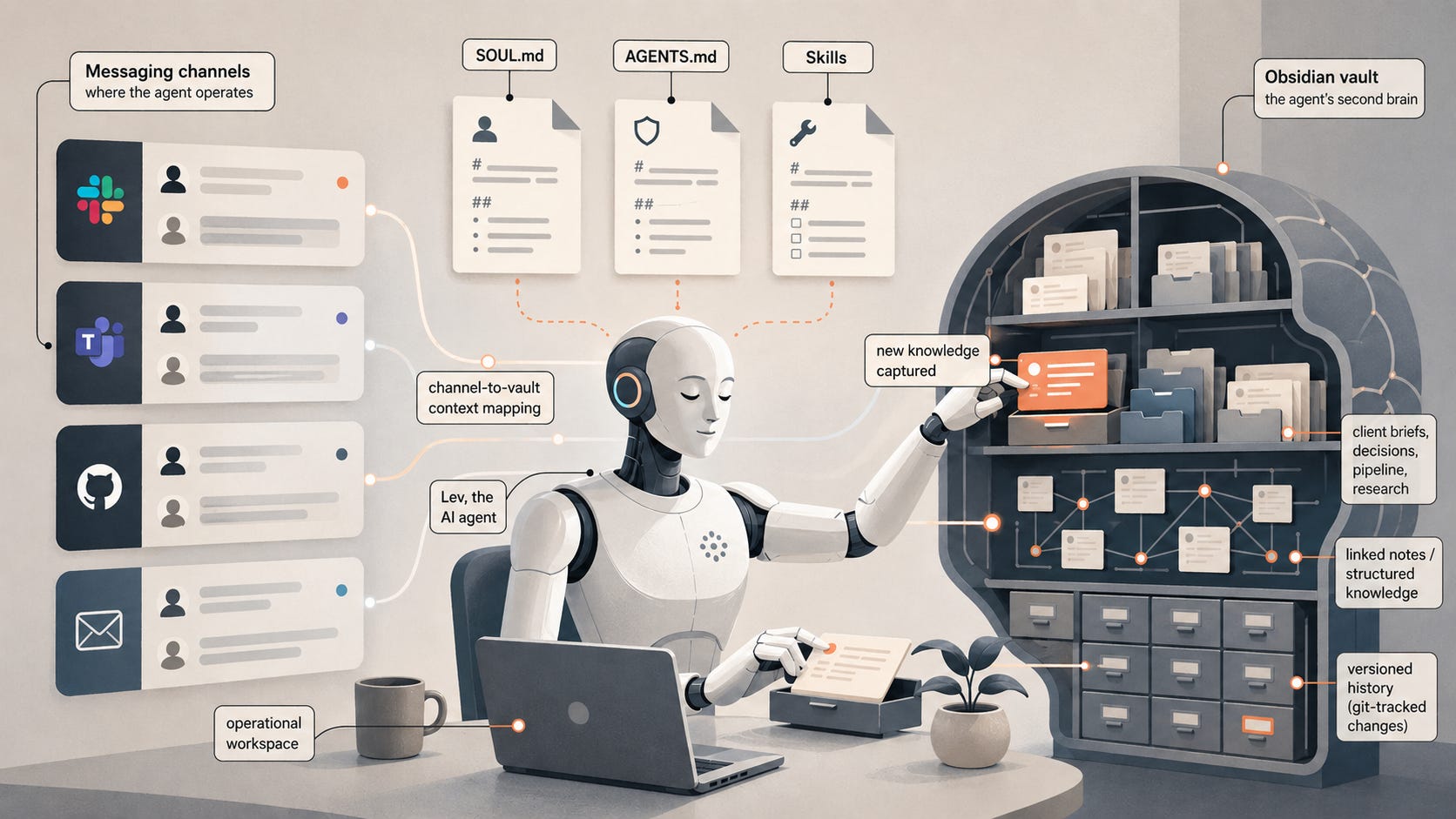
I started with one of our previous articles, We Gave Our AI Agent Its Own Second Brain, and asked the model to read it and create an illustration of what the article describes. The only style direction I gave was to depict the system literally, not in an abstract way.
Here is the prompt I used:
Here is an article I published on my Substack: [URL of the article]. Read it carefully, then create a single editorial illustration that visually conveys what the article is about, something a reader could glance at and understand the gist of without reading a word. The illustration should be accurate to what the article actually describes, not slop, not convoluted, and not abstract. Style: editorial, like illustrations you would see in a thoughtful tech publication. Aspect ratio 16:9. Muted palette with one accent color.
The output seemed really good at first glance, but I wanted to make sure the composition was truly accurate.
This is why I followed up by asking it to annotate the same illustration with the concepts from the article:
Can you annotate the image to show the concepts and ideas from the article you have included?
The results truly impressed me: the model added labels perfectly positioned on each element, confirming it definitely followed the article and could explain why it made the image this way.
Test 2: Summarizing a long report into a single infographic
For the second test, I gave the model a link to Anthropic’s 2026 Agentic Coding Trends Report and asked for a NeurIPS-poster-style (a famous AI conference) summary of its main arguments and findings. Note: I enabled thinking mode to handle this more complex example.
Here is the prompt:
[URL of the report]: Read this carefully and create a large infographic, in the style of a NeurIPS poster, that explains its main arguments and findings to someone who will not read the original. The infographic should be accurate to the source, not slop, not convoluted, and not abstract. Muted palette with one accent color. Every piece of text should be readable at normal viewing size. Do not invent claims, numbers, or findings that are not in the source.
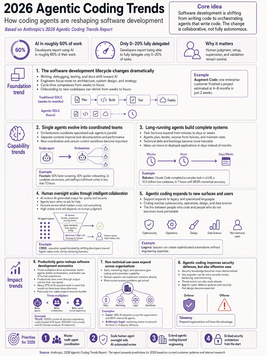
The output captures the main structure of the report: foundation trends, capability trends, impact trends, and 2026 priorities. Stats are pulled from the source, examples are cited correctly, and there is even a source line at the bottom. Everything is clear and readable.
I would still spot-check two or three of the specific numbers before sharing this externally, since image generation models can sometimes hallucinate even when reading from a source. But as a way to extract the core arguments from a long report, it works surprisingly well.
⸻
Test 3: Visualizing a project roadmap
I uploaded the planning document for one of our previous projects, and asked the model to turn it into a flowchart. I deliberately gave minimal style guidance to see what the model would do on its own.
The prompt was just:
You will find enclosed a detailed project roadmap. Create a large flowchart that visualizes it accurately.
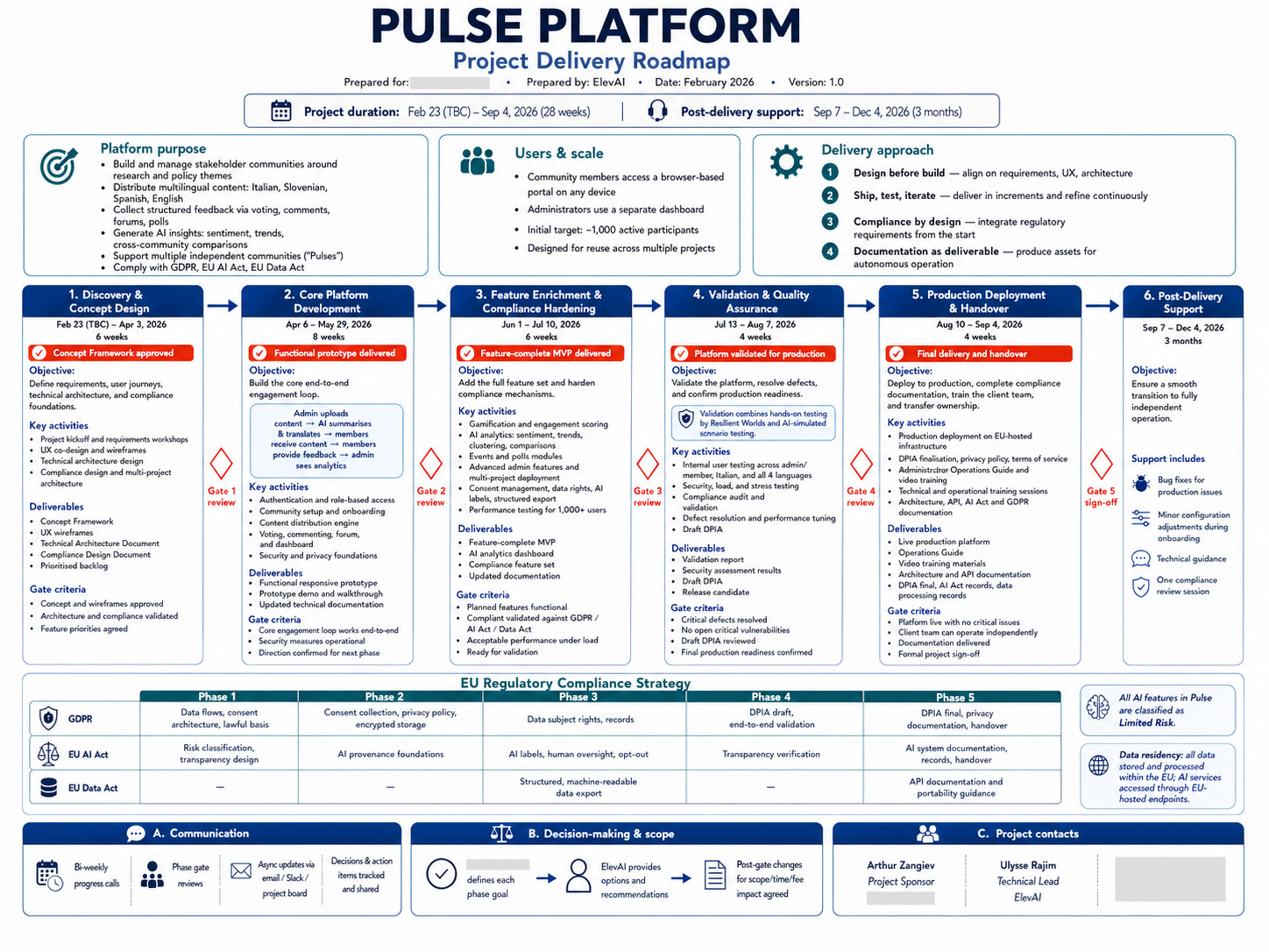
The result is a structured visualization with phases, milestones, deliverables, and team responsibilities, laid out in a way that could be used as a slide in a real client presentation. The model chose the layout, the color palette, and the level of detail without further prompting.
The lesson from this test: simple prompts yield better results. I had been over-specifying style and structure on earlier tests, and the model produced better work when I gave it less to work with and more room to make its own choices.
⸻
Test 4: Personal color analysis (the fun one)
I closed the testing with something less serious. The post that inspired this came from Linus Ekenstam on X a few days ago. You can upload a portrait, ask the model for a personal color analysis graphic, and see what it gives you. I tried it with a portrait of myself:
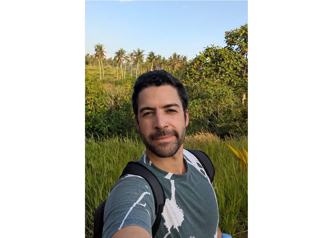
Here is the prompt:
Using this photo, create a personal color analysis graphic. Show side-by-side clothing color comparisons (8 variations) to highlight which colors suit the subject best. Include a “best for you” header, the subject’s color season classification (with eye color, hair color, and complexion notes), and palettes for best colors and neutrals. The face must remain accurately recognizable as the subject across all 8 variations, with the same expression and pose. Visual-first layout with short labels only, no paragraphs.
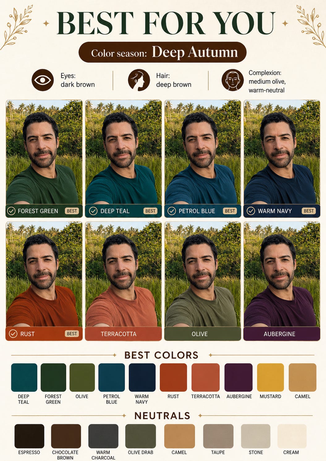
This kind of complex instruction following opens up use cases that would have been impractical before. Virtual try-on is the most obvious (trying on new clothes, testing a pair of glasses, a haircut, or a room repaint before committing), but the same capability also applies to personalized infographics, custom dashboards built from a spec, or any task where the model needs to reason about a multi-part request and compose a coherent output from it.
What this is for, and what it isn’t
ChatGPT Images 2.0 is good at one-off and editing images: illustrations, infographics, posters, simple slides, and visualizations of existing material.
However, it is not a design tool. For a real design system, a UI prototype iterated with stakeholders, or a multi-page document, the better tool is probably going to be Google’s Stitch (free, focused on UI), Figma AI, or Anthropic’s new Claude Design plugin. Those tools produce editable, collaborative, version-controlled artifacts rather than static images.
One thing worth flagging: the realism crossed a threshold that will make deepfakes even more convincing. It is worth being careful with anything involving real people. To try to limit this, OpenAI adds a C2PA watermark to every output, but this probably won’t be sufficient to eliminate the risk altogether.
So, for now, I will make ChatGPT Images 2.0 my go-to for any visual work that does not need Figma-level editability or collaboration. If you had been writing image generation off as not quite ready for business use, this might be the right time to test it again on something real.
It has really come a long way. Thank you for sharing. I also have a personal question I wanted to ask, I left it inbox, when you have time, you can check it out.